A few words from Cultivate, the design studio behind our recent rebrand.
Bartons Pickles is a family-run company based in St Helens, specialising in handmade chutneys, sauces and pickles. Established in 1905, Bartons has built a stellar reputation, and as big fans of their products, we were delighted to join them in giving their brand an extra pinch of flavour.
Working closely with Bartons director and fourth generation pickler, Joanna Jenner, we’d previously designed a new website, which then led to us working on the rebrand project.


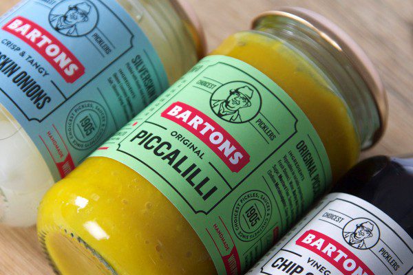
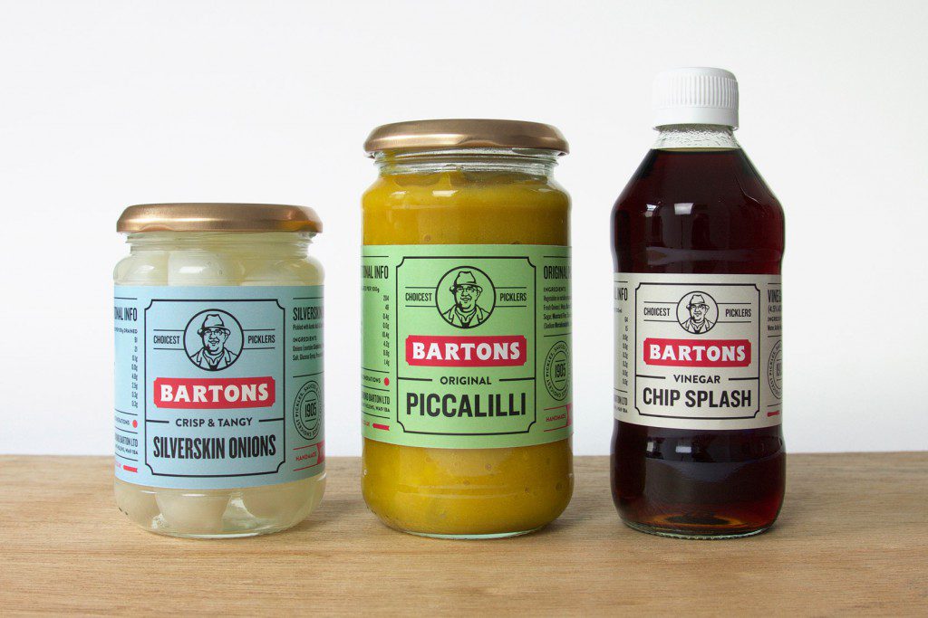
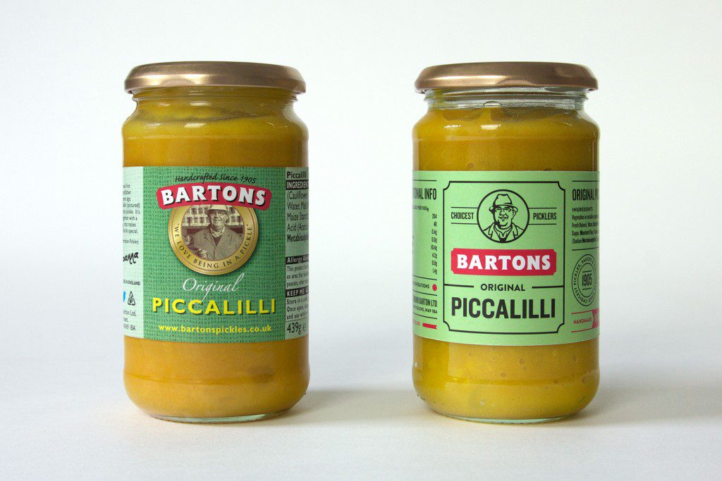
When it came to focusing on the brand’s overall image, our aim was to modernise, refine and add consistency to the packaging, whilst savouring the traditional elements already associated with the popular local pickler. The previous look had begun to feel dated when compared to competitors and ran the risk of blending in on busy supermarket shelves. Celebrating their 110-year heritage, the new labels are particularly striking and really allow the product to stand out.


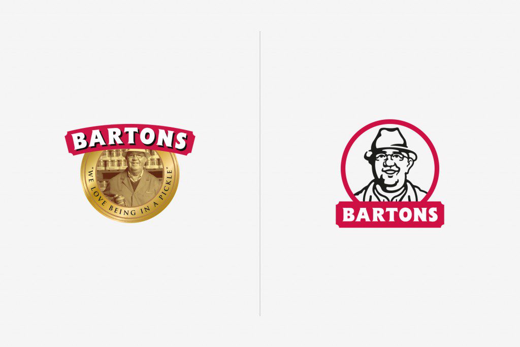
To preserve the existing brand personality, we illustrated Eddie—the familiar face of Bartons Pickles—and kept him at the forefront of the identity. Drawn in-house by one of the Cultivate team, the illustrated logo has a distinct and recognisable quality that serves to add to the personal, handcrafted nature of the product. Although refining the visual style, we retained familiar elements, such as the Bartons wordmark and product colours, in order to aid brand recognition.
Some of Bartons best-selling products, including Piccalilli, Silverskin Onions, Mint Sauce and Chip Splash, are now available in the new look, with the full project consisting of around forty labels across the range.
Bartons director, Joanna Jenner, shared her thoughts on the refreshed style:
“We’re very proud of our heritage and handcrafted products, and are thrilled that the new packaging helps to promote that. We can’t wait to see it on shelves!”